Photo/Film Editing Guide
A page in progress. This page shares my perspective on what adjustments (contrast, saturation, color tints/tones) you can make to your photo/films, to portray the feeling you want your work to give off. I am not a professional.
Abbreviations I will be using in this page are Low Contrast (LC), High Contrast (HC), Low Saturation (LS), High Saturation (HS).
Saturation and Contrast
Usually, I lower the saturation and increase the contrast to create photos that spark "deep" feelings. "Complex" composition HC with LS creates ranges from sparking hope to depicting chaos. Sometimes if you take a random photo and increase the contrast while adjusting the brightness such that the photo doesn't look overly bold, your photo will turn "professional".
Higher saturation with lower contrast may generally give off a vibrant, lively, or "carefree" animated vibe. The color richness may even portray an "anime-like" feel (e.g. Studio Ghibli scenery). When neither very deep shadows nor strong highlights (low contrast) are present, the color richness present may give a 2D perspective. LS with LC are suitable for shots when one wants to make viewer feel calmly energetic. However, when contrast is lowered too much, it may look like the photo is "fading away" to greyness.
Color Tones
Warmly tinted, high saturation
Because of the warm tint, one may feel nostalgia. This nostalgic feeling can stem from the fact that our memories are "hazy" and blurred in our minds, and seeing a visual depiction of the photo's subject with that "haziness" evokes similar emotion. Color fading (Photodegradation) on photos may also bring nostalgia: photodegradation is the term for the color fade in photos. To replicate this effect, one can lower the contrast while adding a tint (green/pink) to the photo. Lower contrast reduces the amount of shadows, giving you the faded look (Lowering contrast by too much may cause photo to look gray). One can also reduce vibrance to achieve the effect.
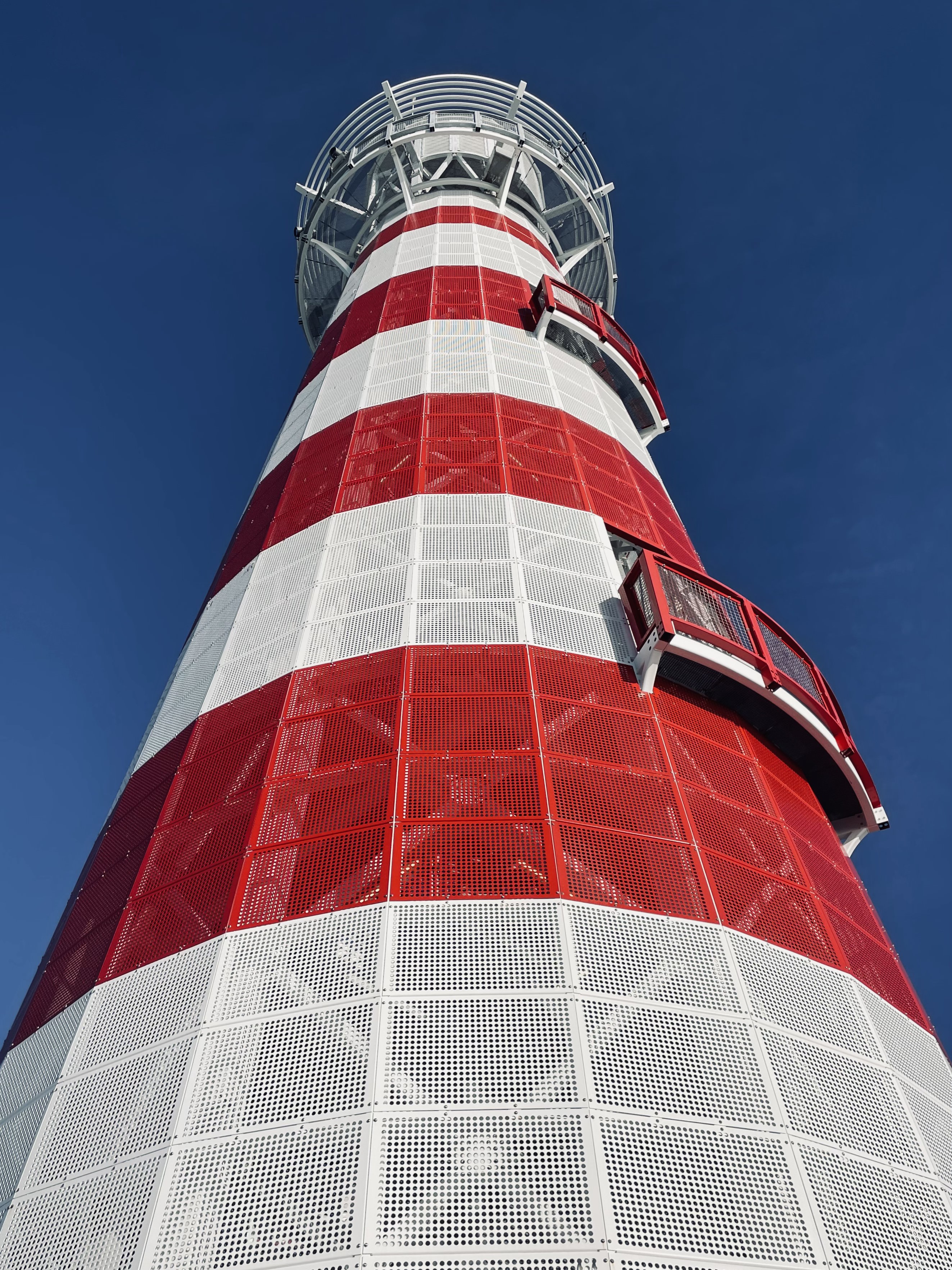
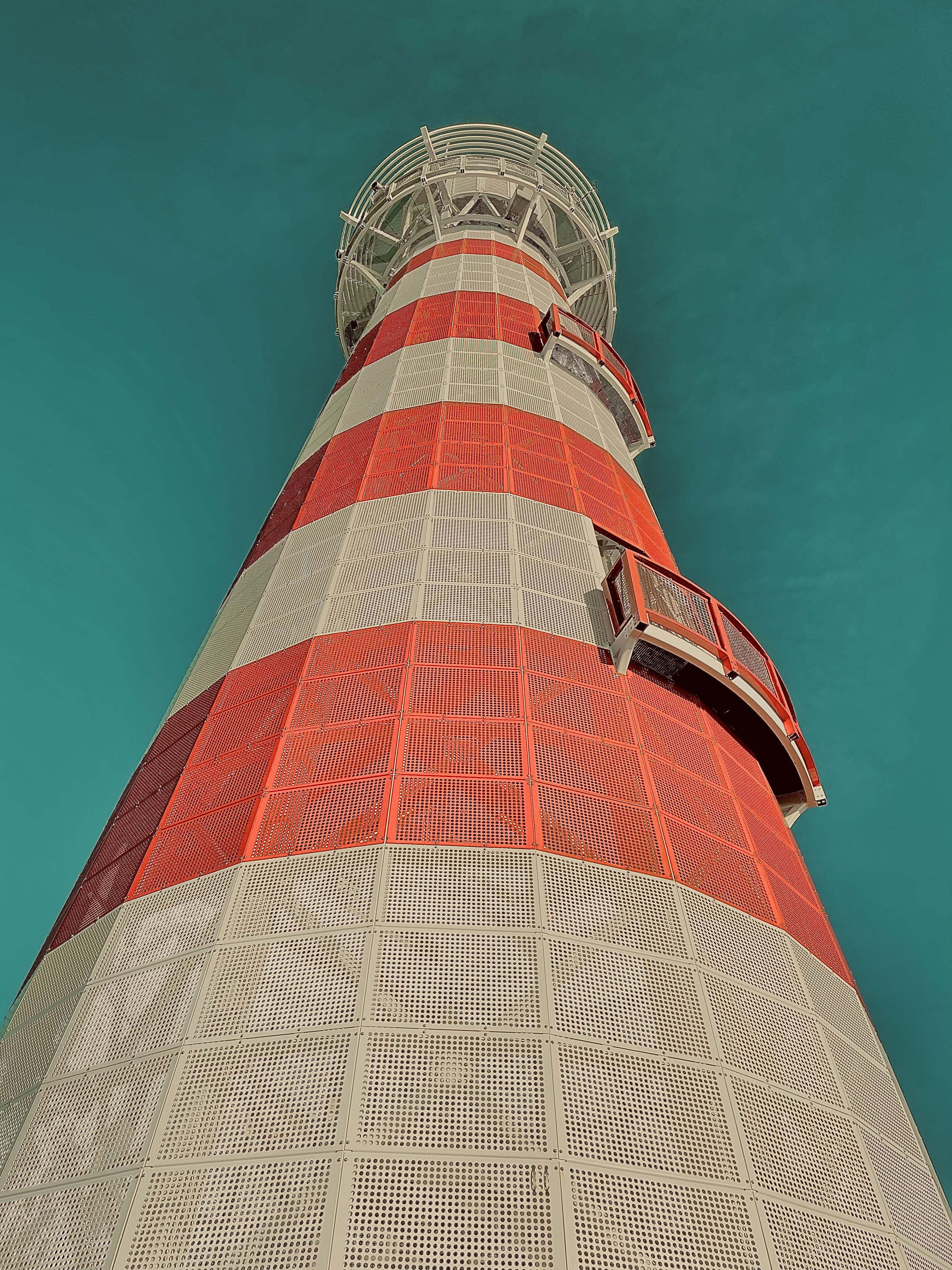
For photos with a blue-based color, adjusting with teal blue can give off the aged feel— teal is located between the conventional blue color and green on the color spectrum, hence makes a blue-toned photo look "warmer". Below photos' teal sky was edited by increasing saturation and warmth. The low contrast of the bottom-right lighthouse photo adds a faded effect. The bottom-left lighthouse photo was the original photo, but had its contrast raised slightly.
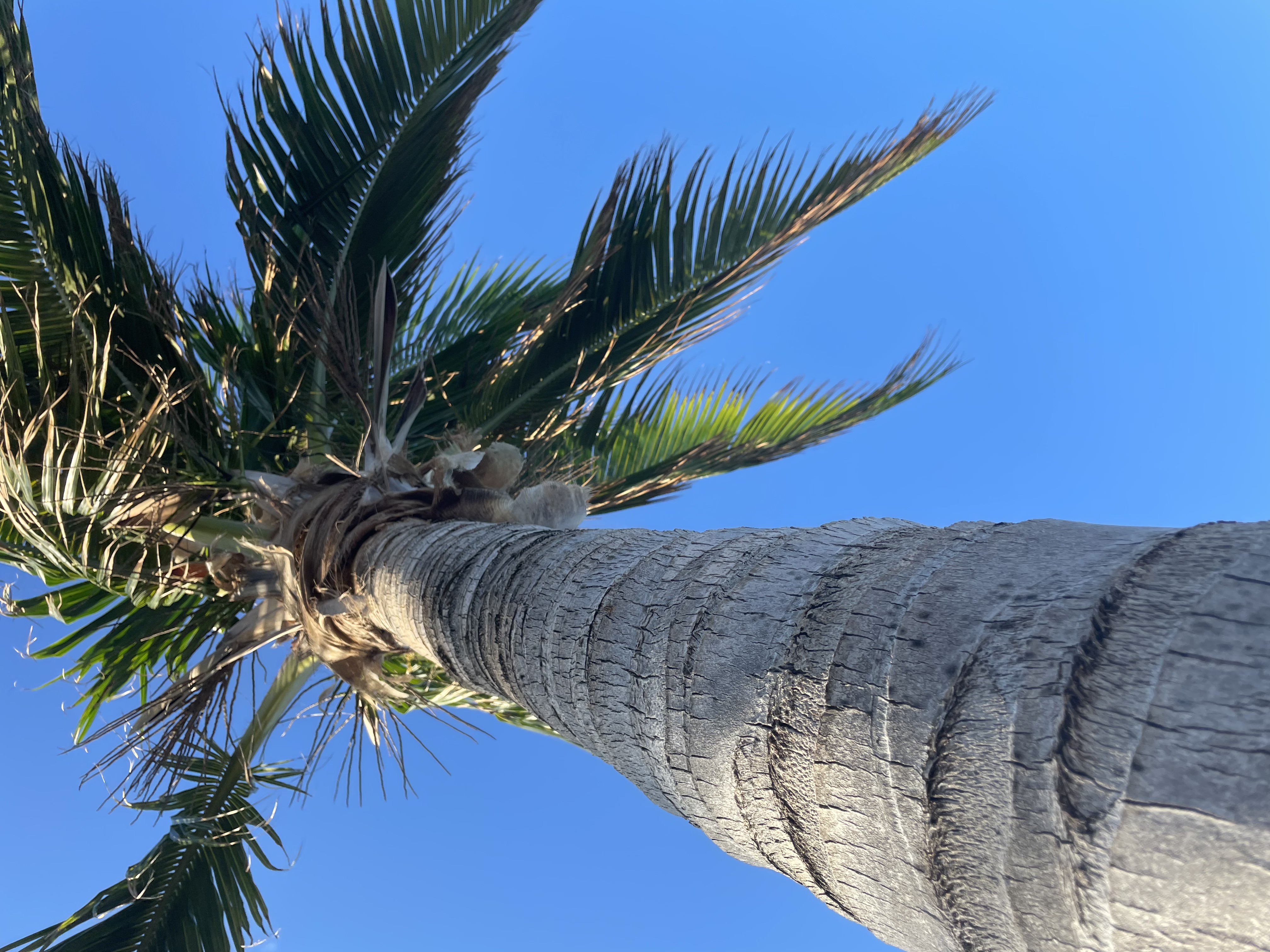
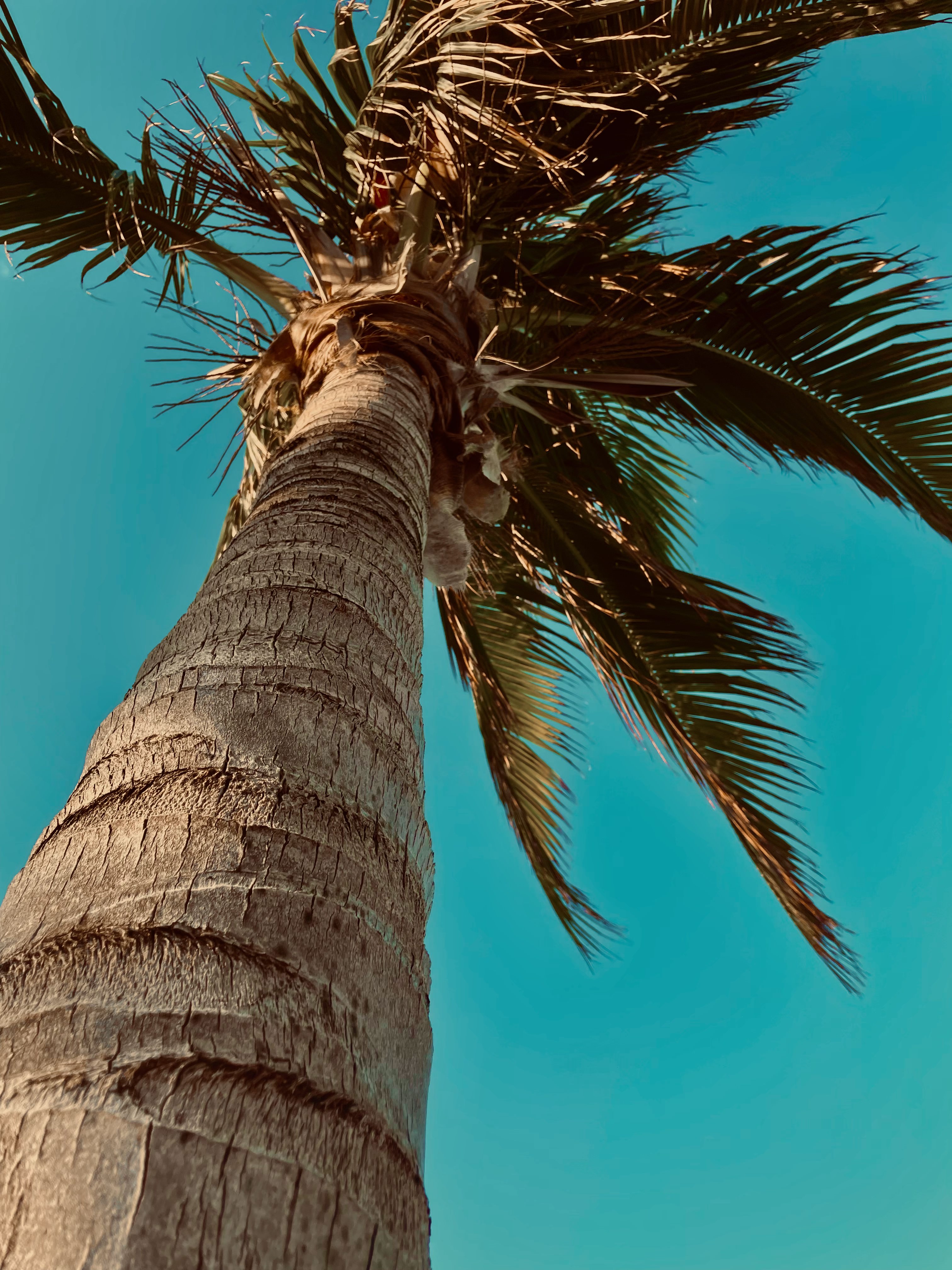
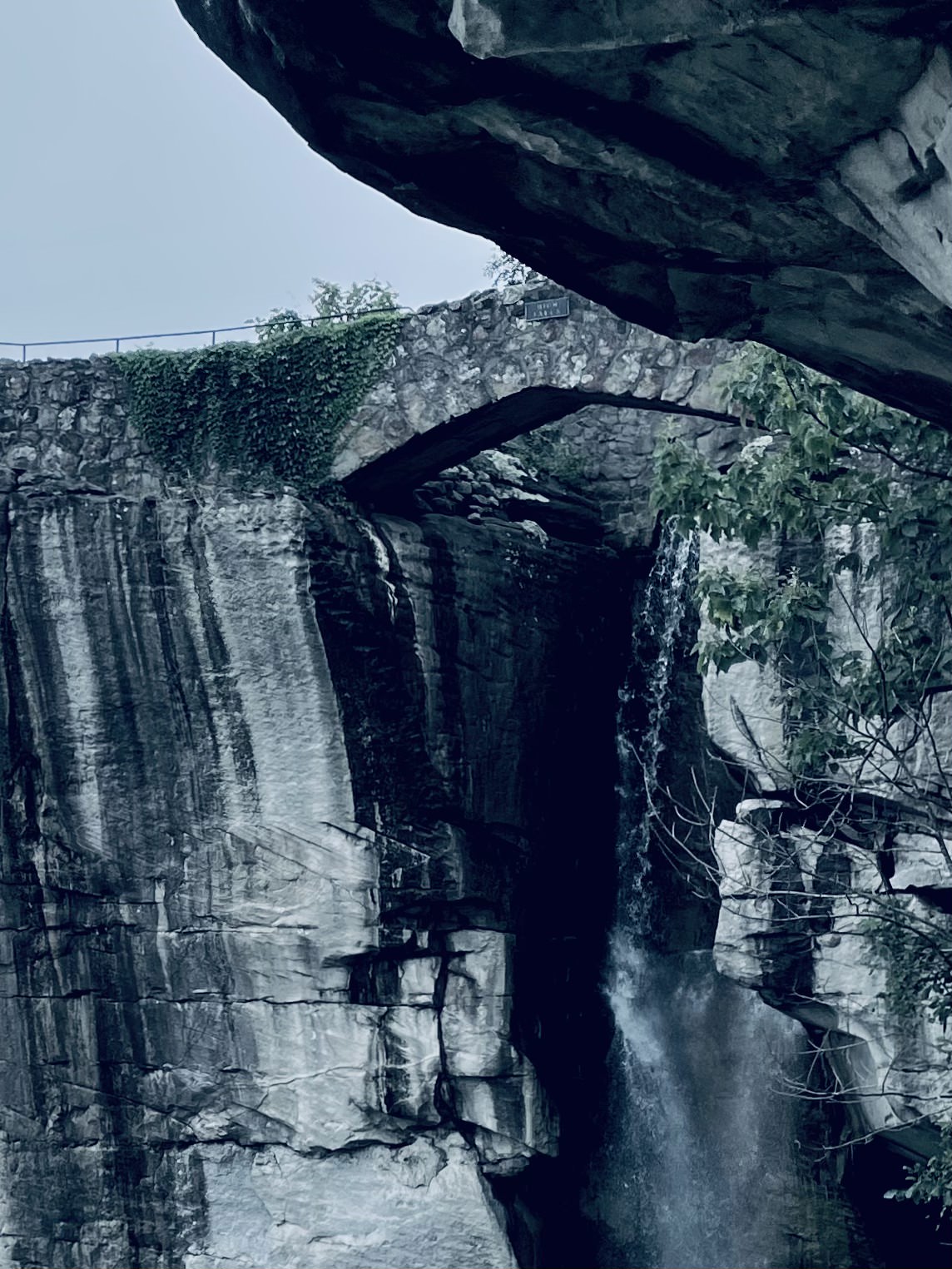
Green/Blue in Scenery
May give off a tranquil vibe. For films, lower saturation with higher contrast may be invigorating when paired with cinematic/epic music. May inflict quietude when paired with ambient music. Scenery shots with high contrast may give off more complex emotions (as shown im photo comparison below).

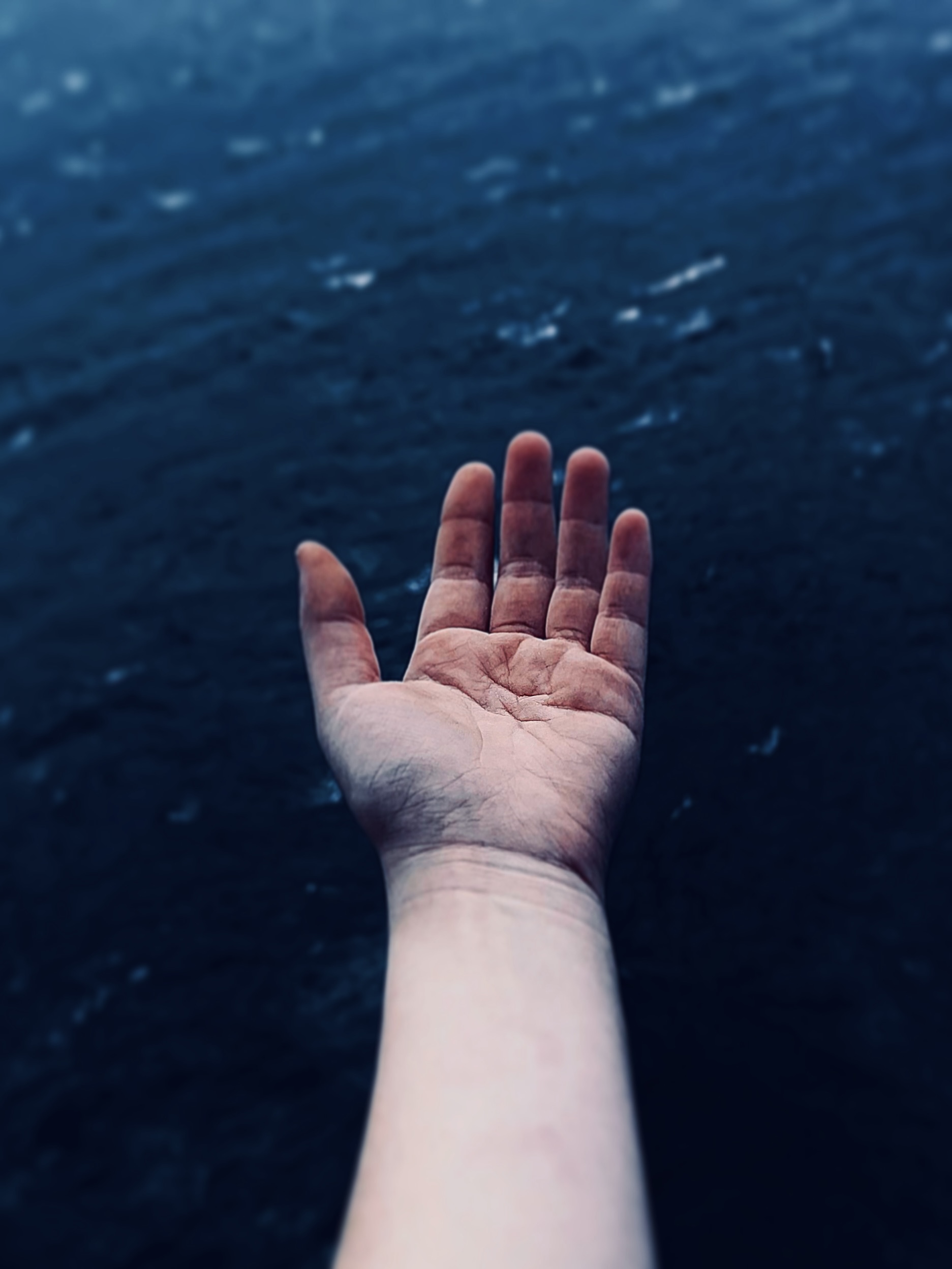
Blue
In general, blue tones with high contrast can appear gloomy or forlorn. Often we think of "maritime" style photos. Lower saturation may give off a distant feel. Ideas include a night skyline with (blue) city lights, city scenes, and beaches/ocean/water.

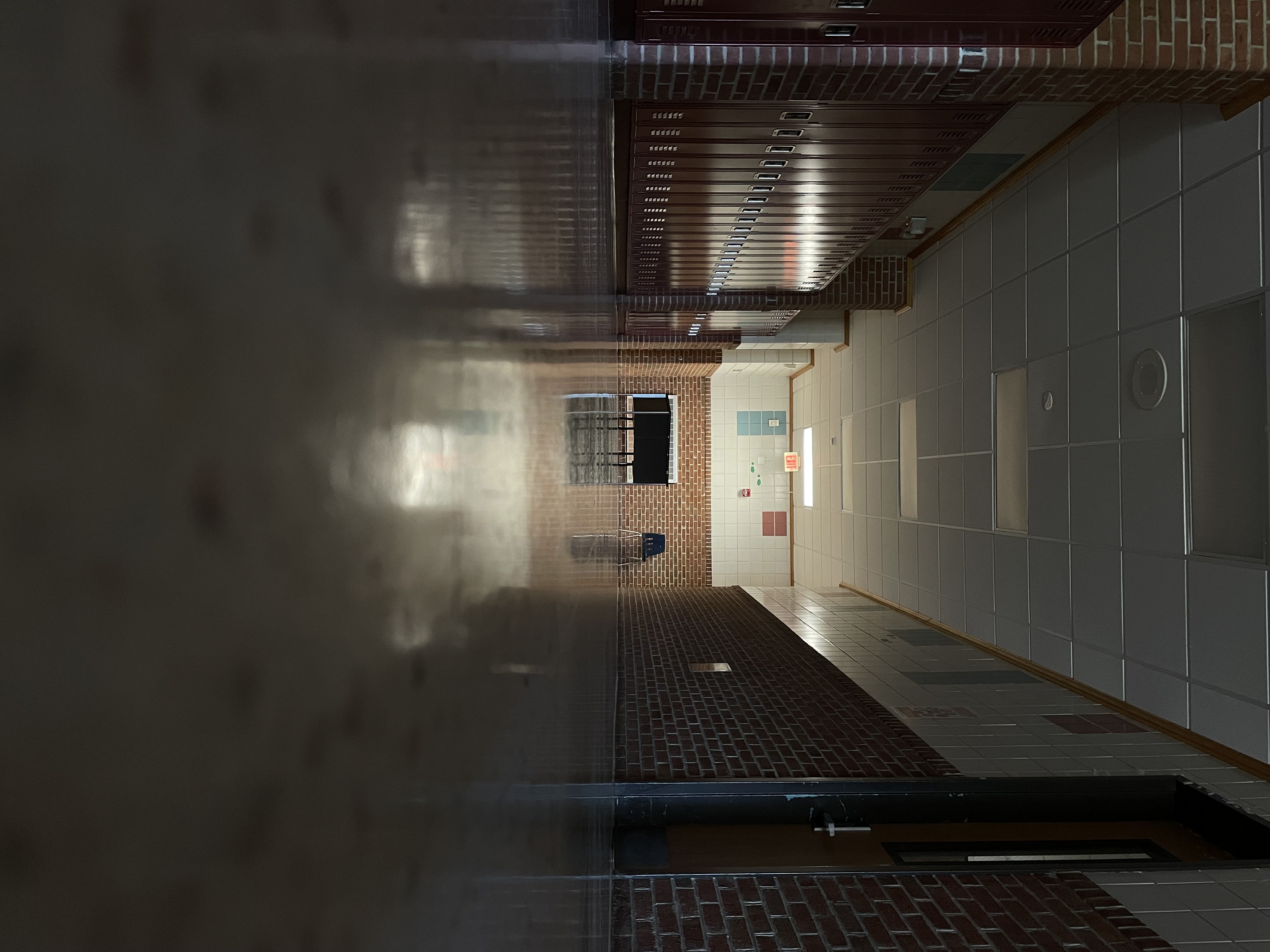
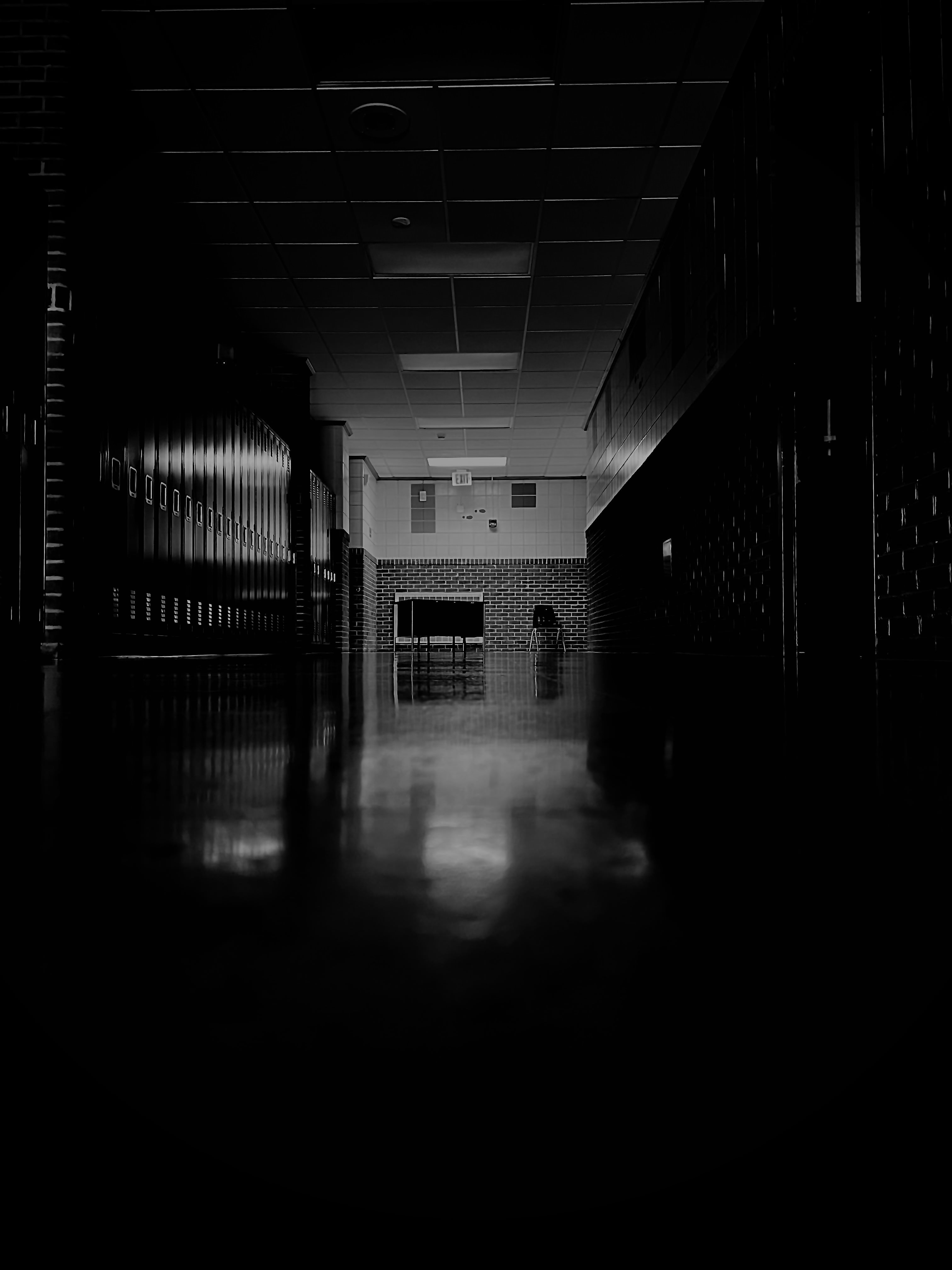
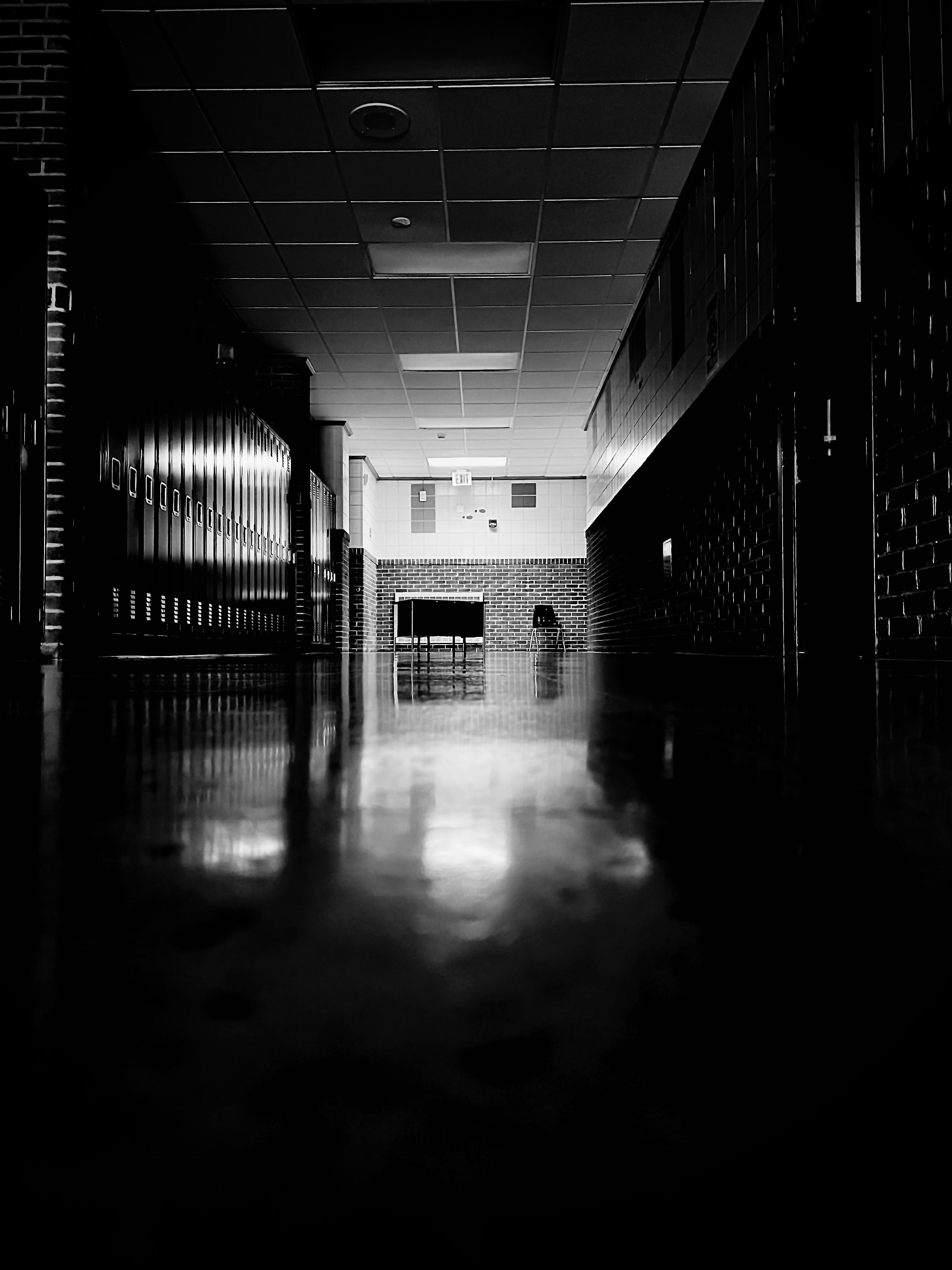
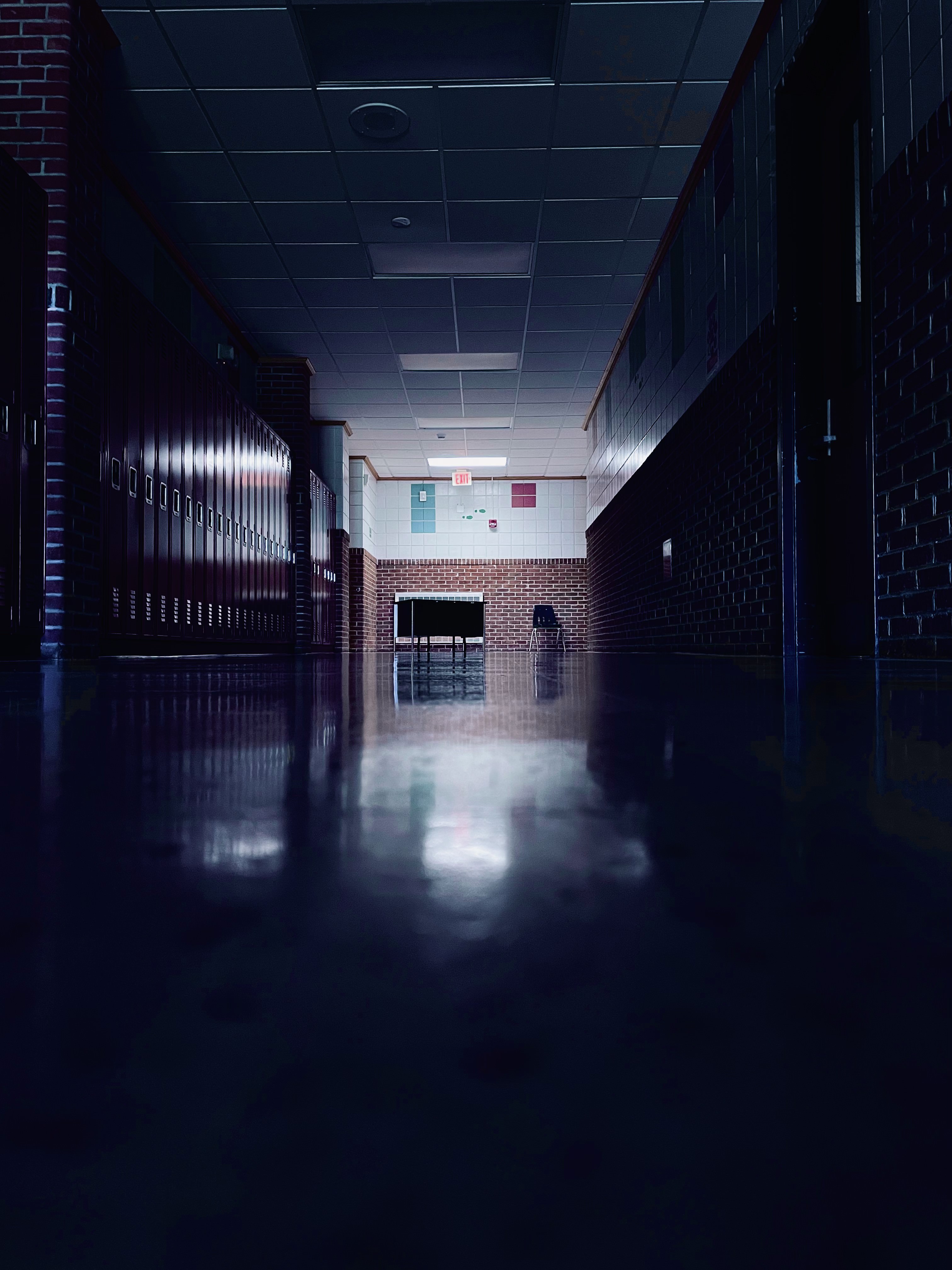
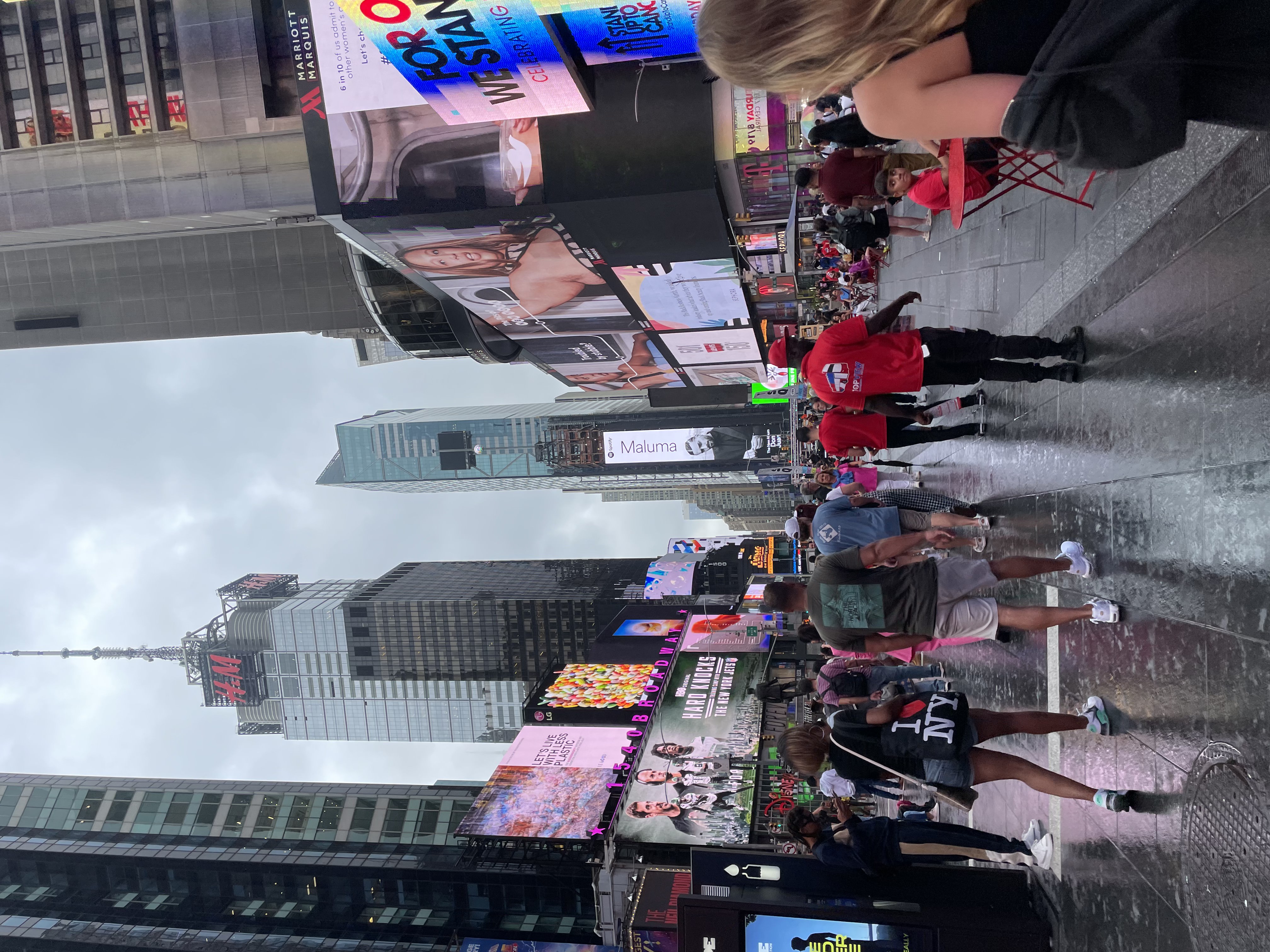
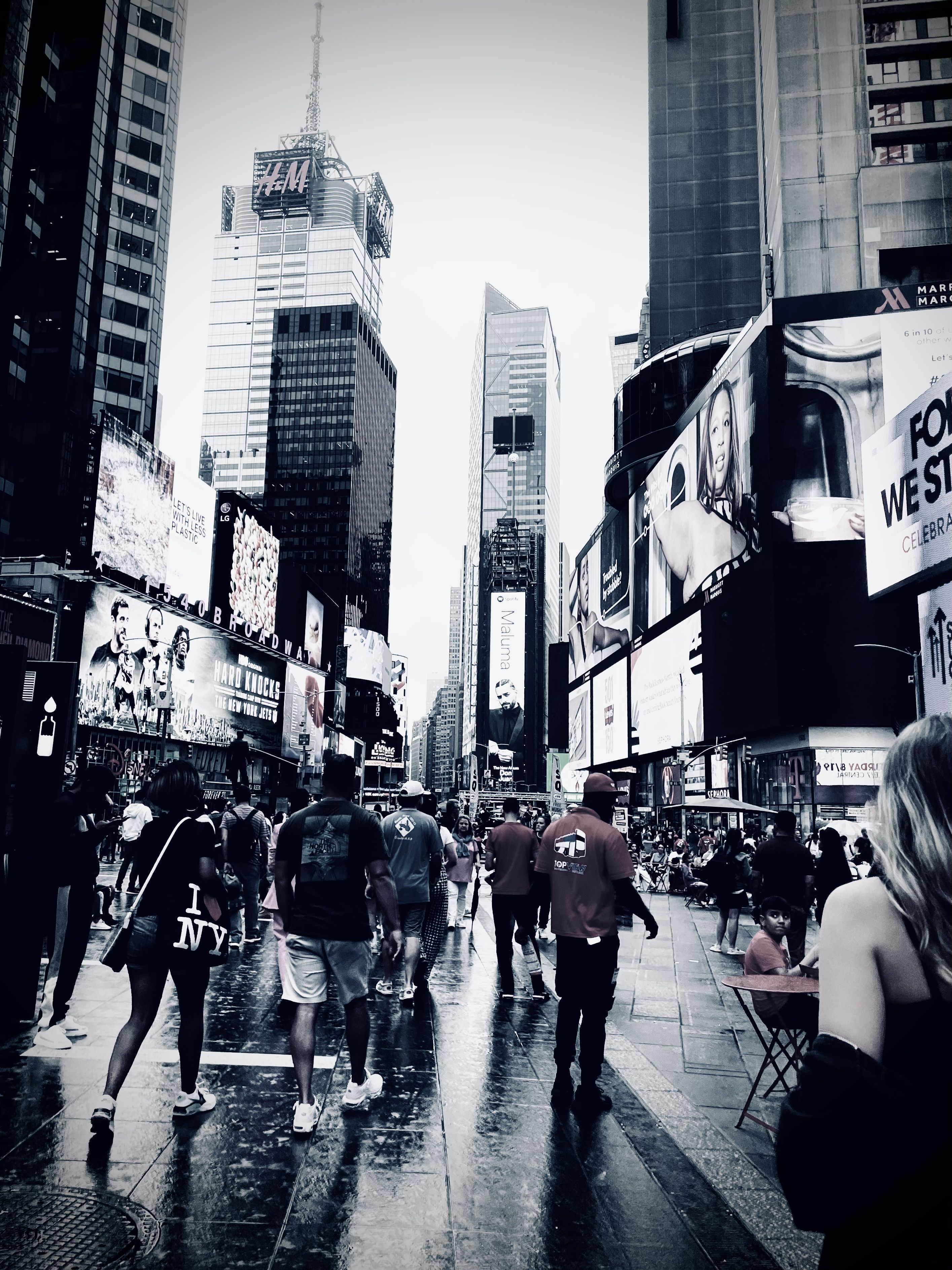
Black and White (BnW)
You can create more "mysterious looking" images by lowering exposure, such as on the image on the top right. The first image is the original photo taken. The bottom right image has its saturation up and toned to a blue-ish color. These images give off different feelings by merely changing color and contrast.