Plant Photography with iPhone
2025—— I have been photographing these small flowers, weeds, and clovers for some years, and I thought I'd note down some insights.
Photographing small plants
I try to find an angle that makes the flower either centered or on one of the three dividing lines (rule of thirds). Feel free to turn your iPhone camera 180 degrees upside down (sometimes this makes it easier to capture). If a flower feels unflattering, it's usually due to the angle you're approaching it with. Generally, it may be easier to go for flowers that display more symmetry. For example, if you're looking to capture a "clean" shot, finding flowers that have "filmy petals" may not be the best option.
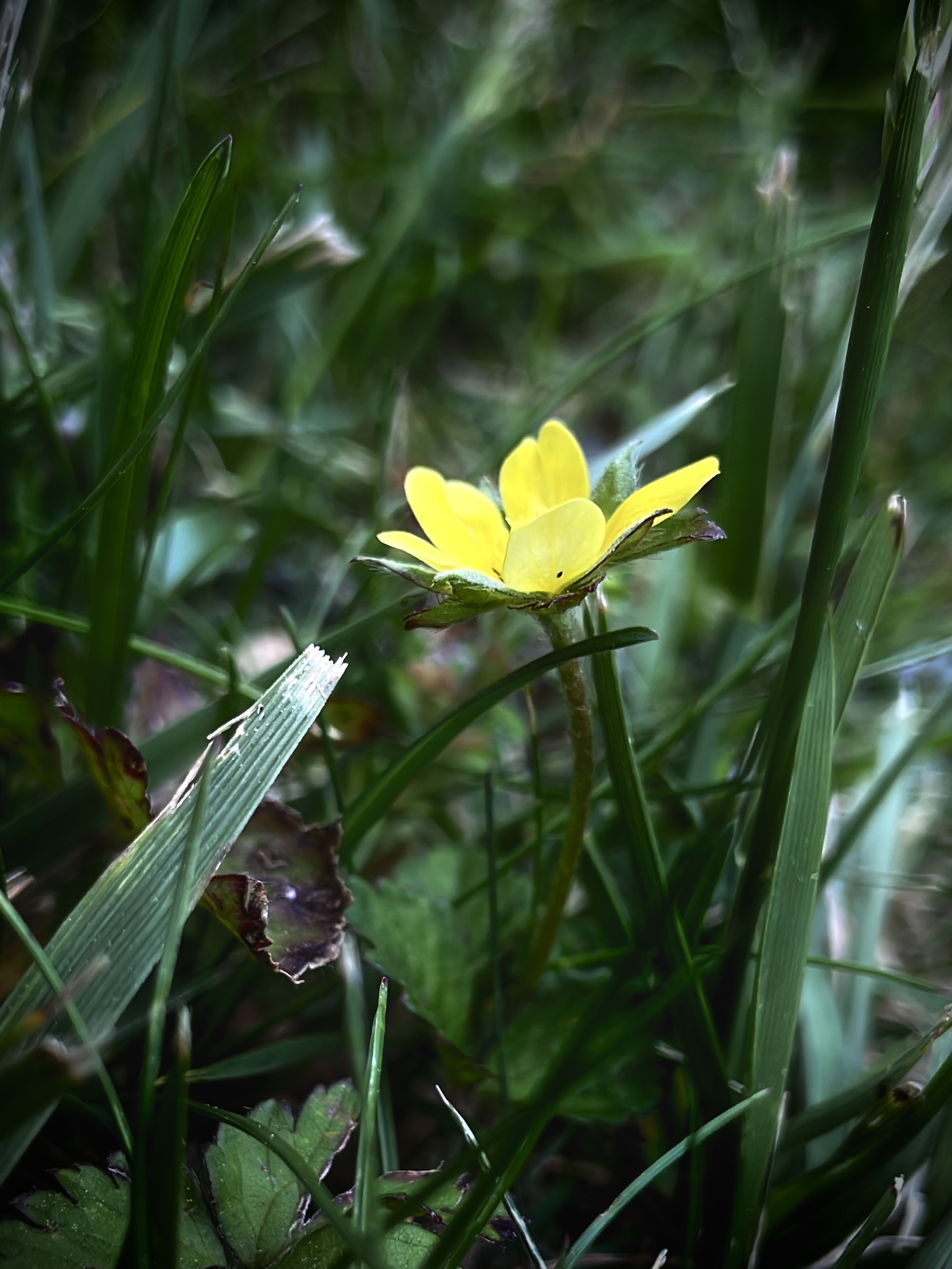
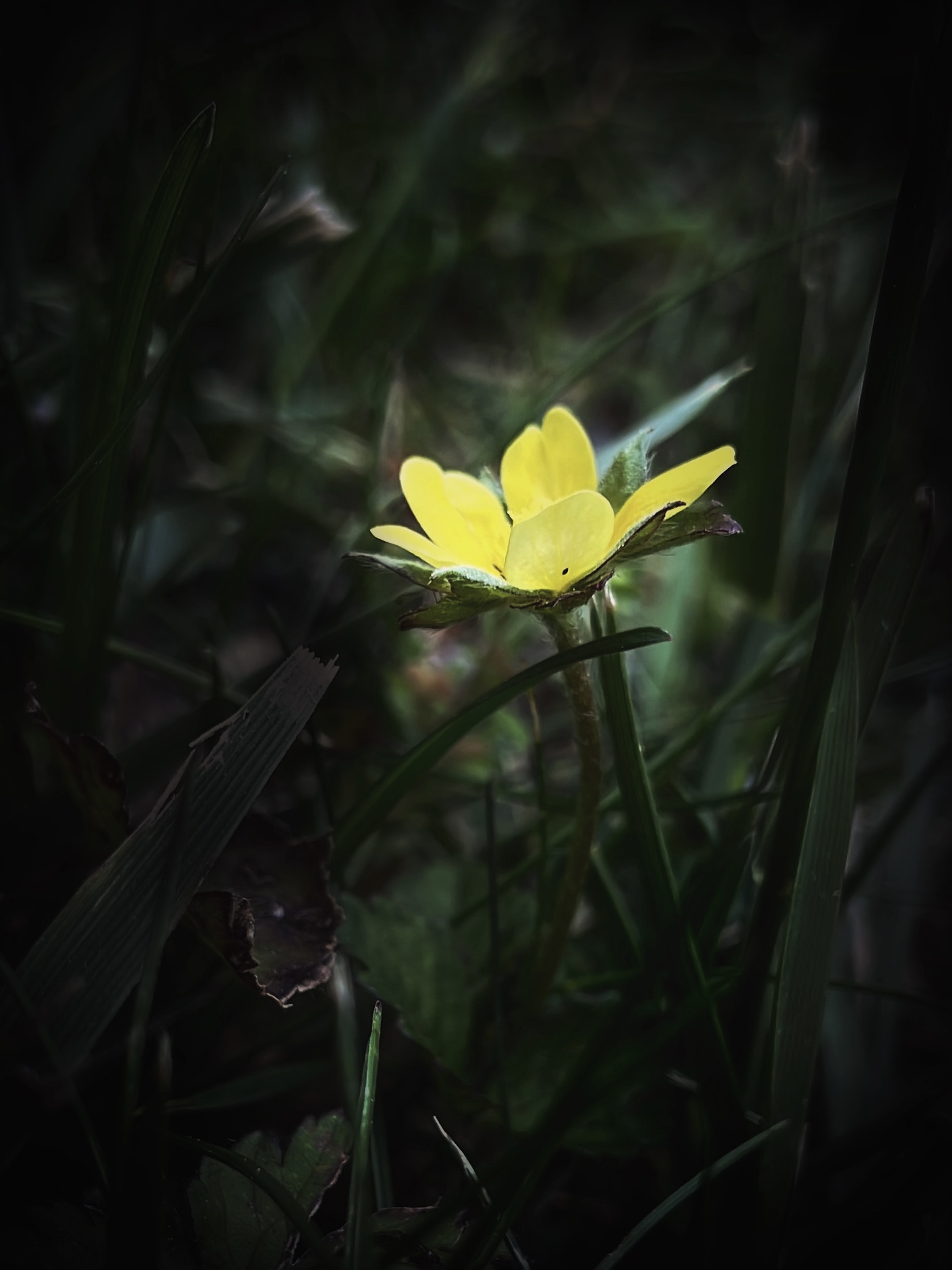
For example, the two photos below feature the same flower, photographed with an iPhone. Both photos are taken in iPhone's video mode— which I highly recommend sometimes when taking plant photos. I think iPhone's video camera mode can makes your taken photos look more naturally focused. The regular photo mode can give an artificial lighting that makes the photo looks "brighter" than reality.
Paying attention to surrounding objects and lighting!
In the first photo below, the light reflected off the grass was a bit distracting. Therefore, I edited it a bit, removing the flare, as seen on the 2nd photo below.
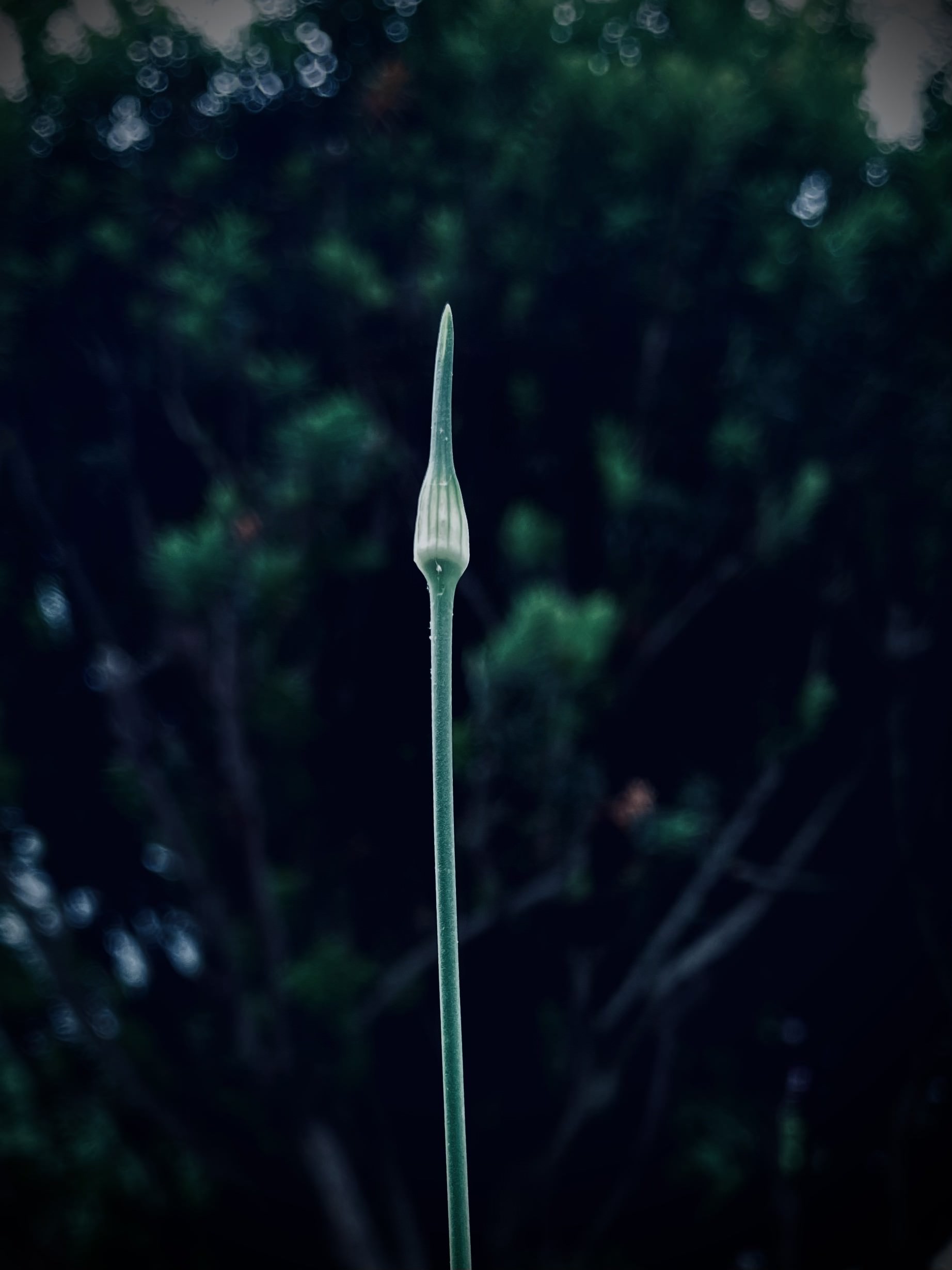
Selecting a plant to photograph
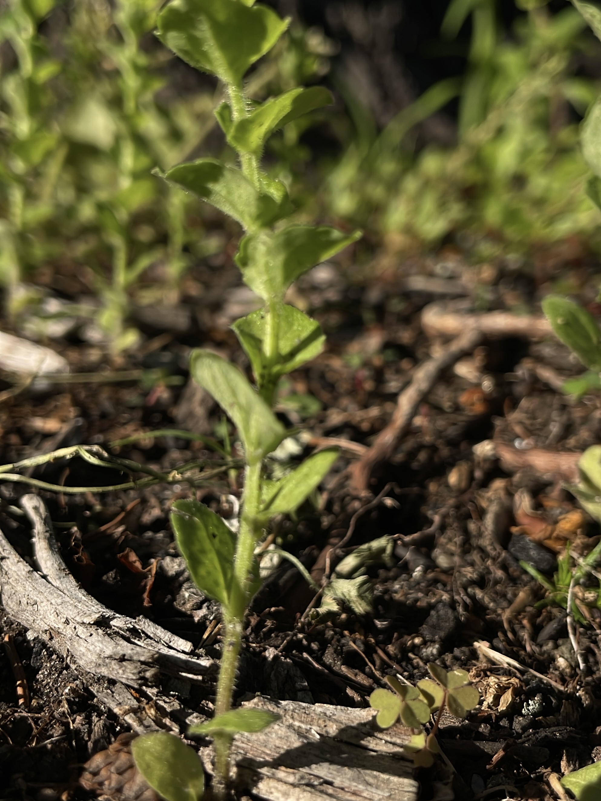
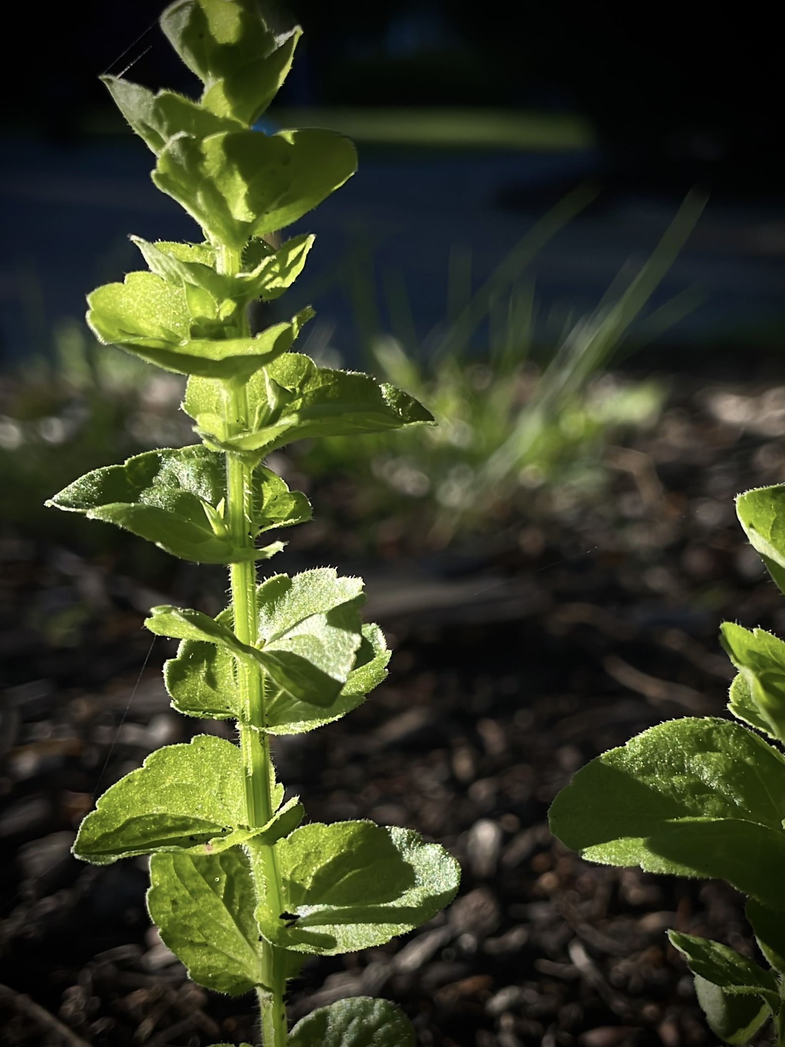
Sometimes, the most crucial part all comes down to selecting a plant that is easier to photograph. For example, in below images, even though I found a better angle for the weed (2nd photo), the photos still look a bit too messy to my liking. I think it's because the plants itself are a bit "fuzzy" (I mean that they lack our conventional patterns like symmetry).
Plant Editing with iPhone: Notes
I generally like to reduce the brightness and add the vignette frame, so that the vignette "blends" with the darkness of the photo background. A "really obvious" vignette, I think, makes my photos look over-edited. Additionally, I like to reduce the brilliance of the photos: having a less contrasting background makes the photo subject stand out more.
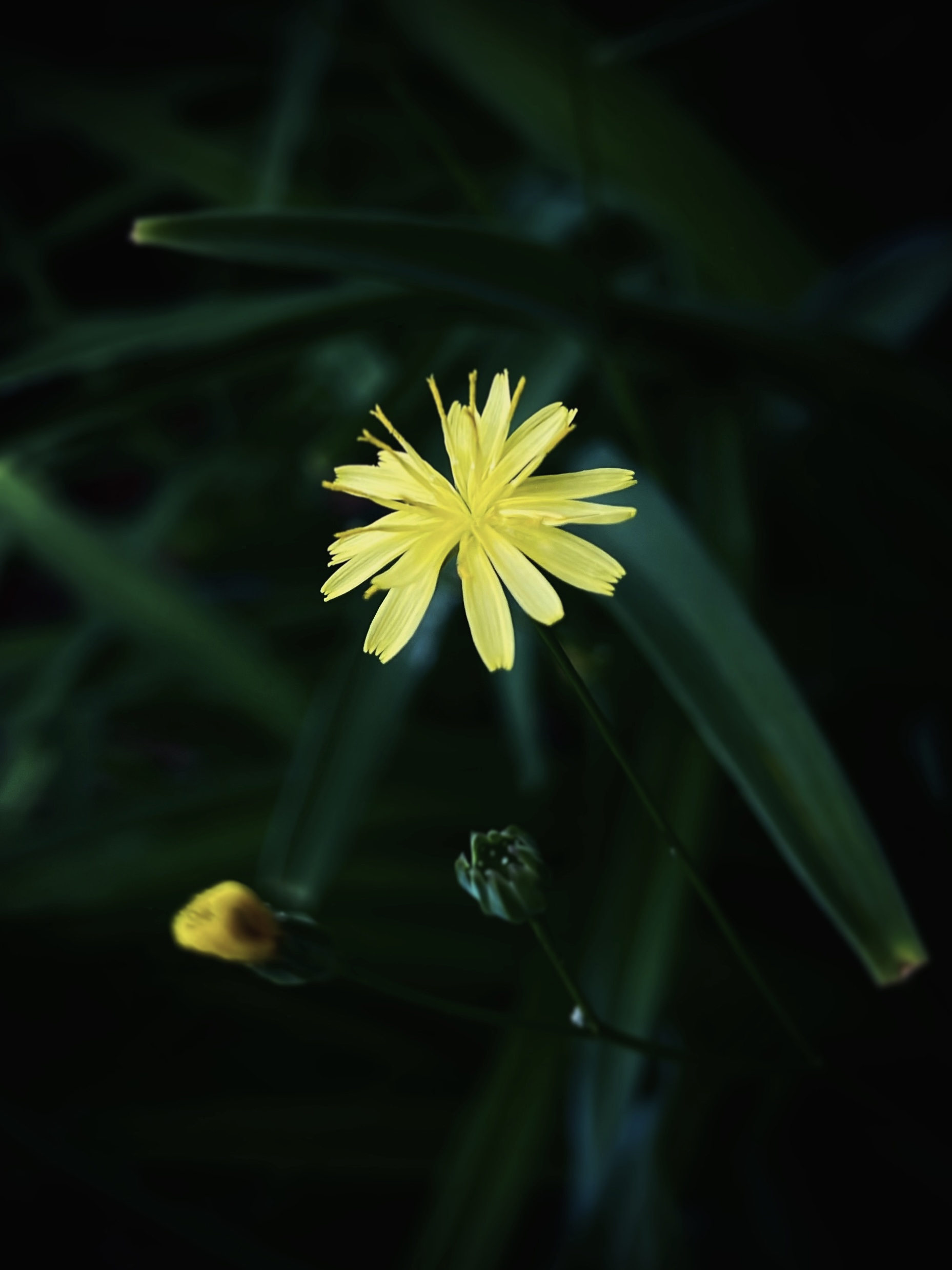
Color Tone
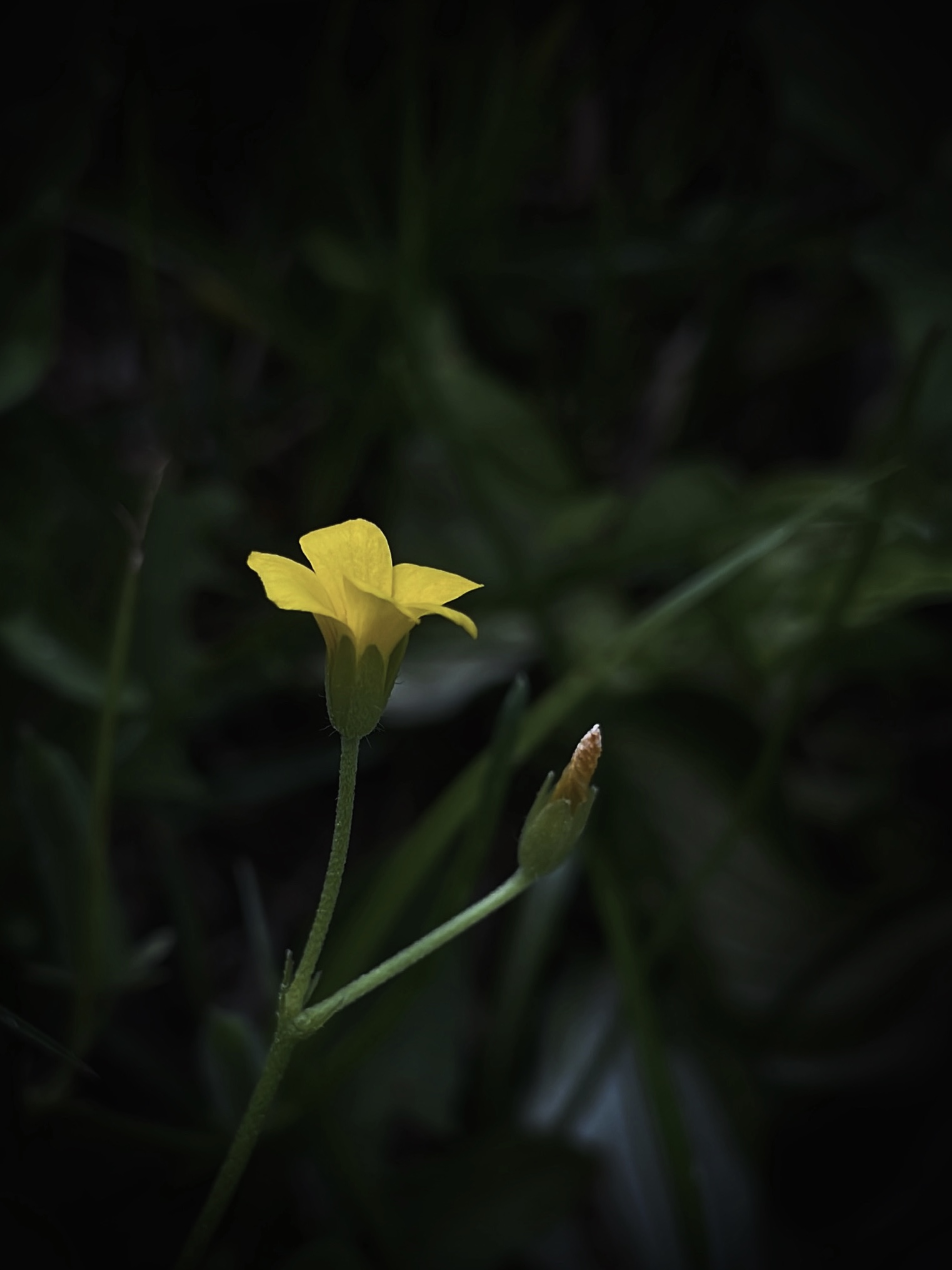
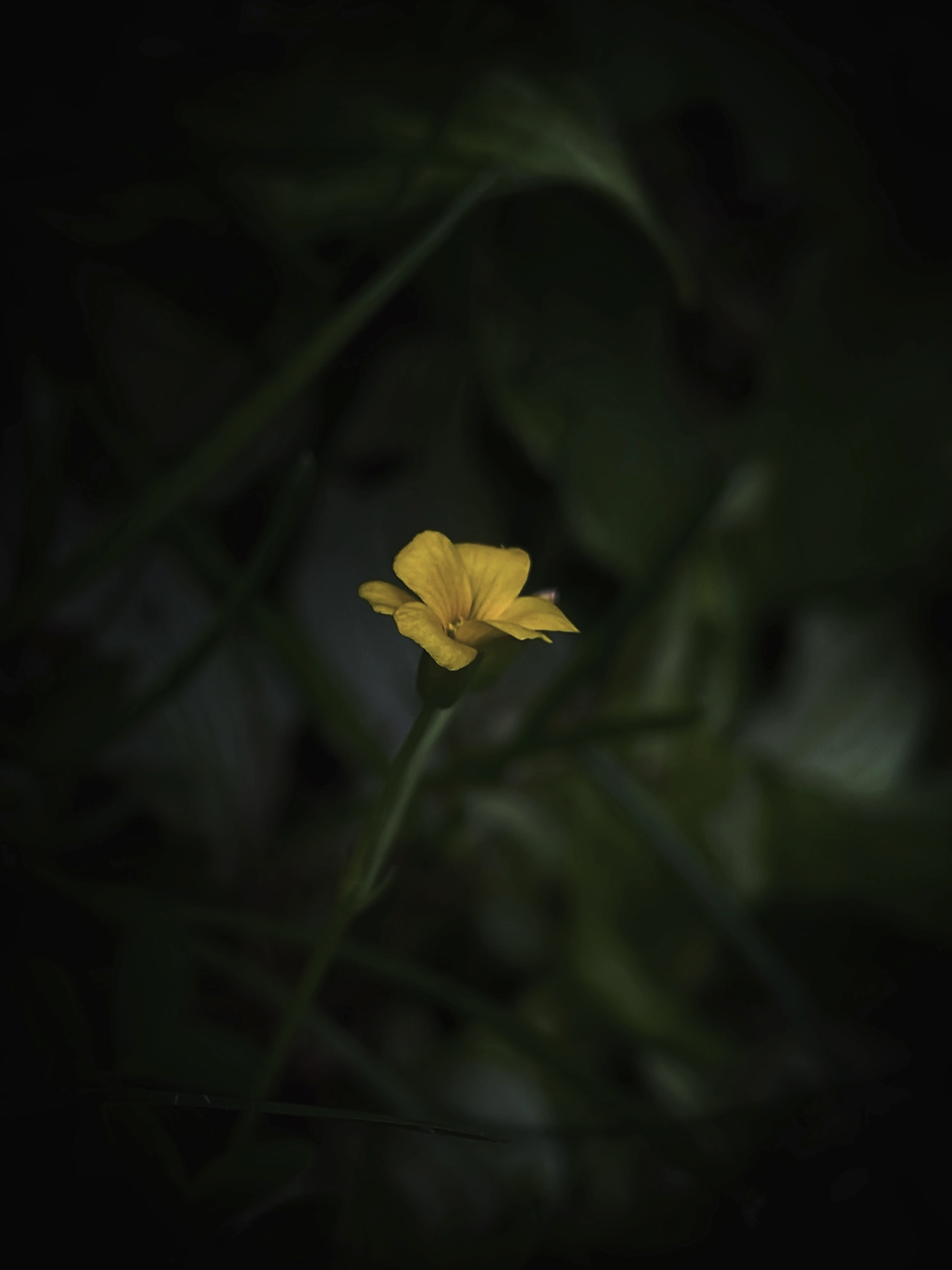
I also play around with color tone a lot, though I still sometimes can't figure out if I should make a photo look more warm, cold, or neutral. I think the "challenge" is finding what tone pairs well with the plant subject. For example, if I have a yellow flower and I decide to implement a cool saturation, the flower might end up looking green (which I don't desire). This is as seen in the photo below: for me, the flower and background doesn't pose the best contrast against one another. This capture of the yellow flower and its leaves remind me of the food eggs-stir-fry-chives.
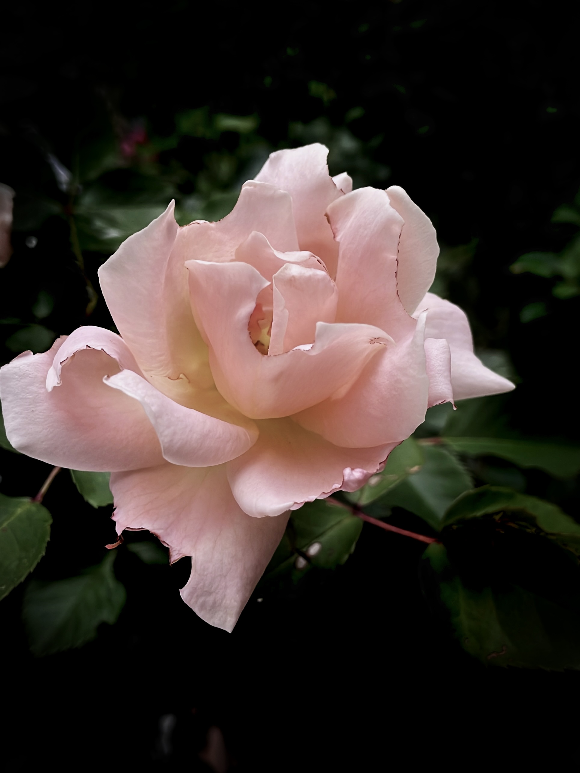
Pay attention cropping/positioning as well. In below photo, I might have cropped the photo too much, making the space seem crowded by the rose.
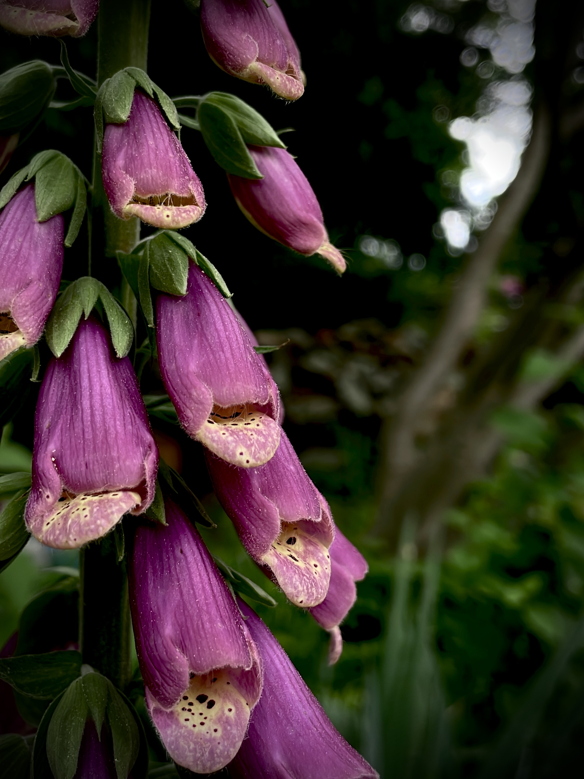
Other Notes
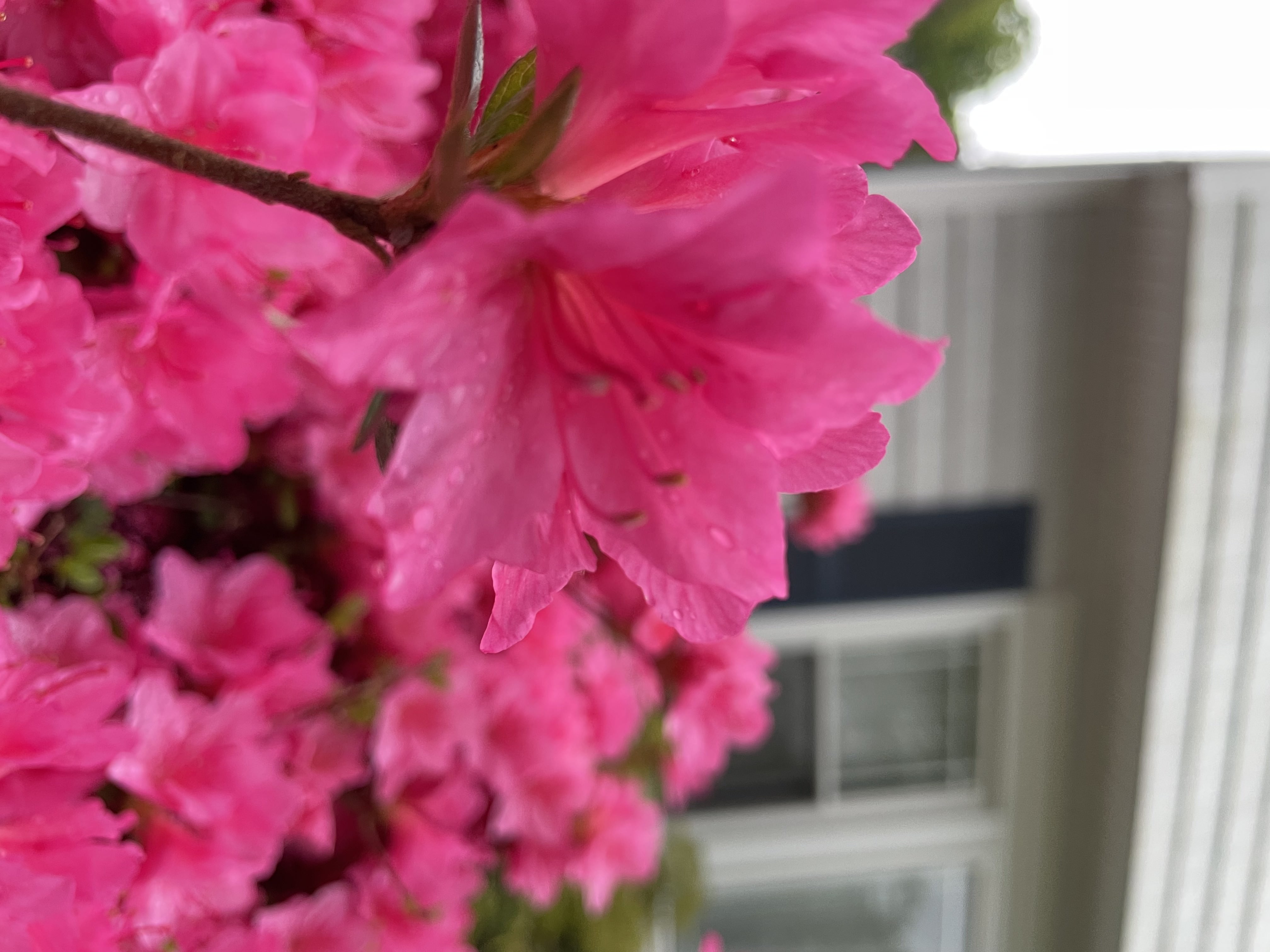
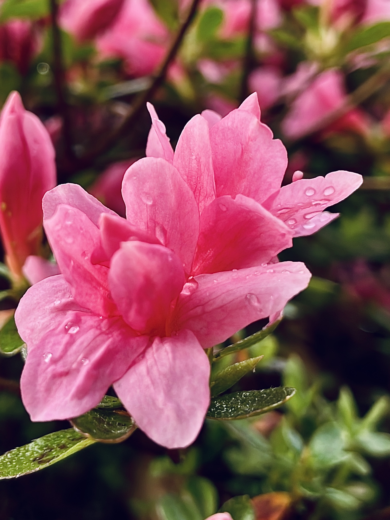
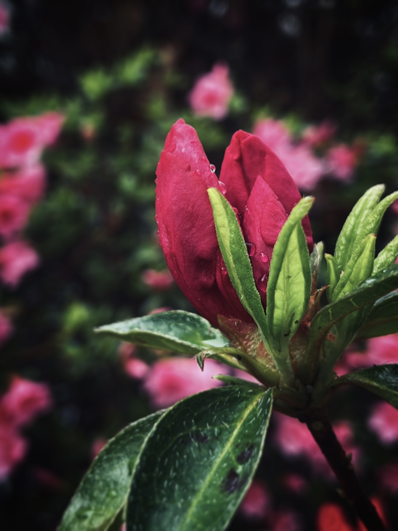
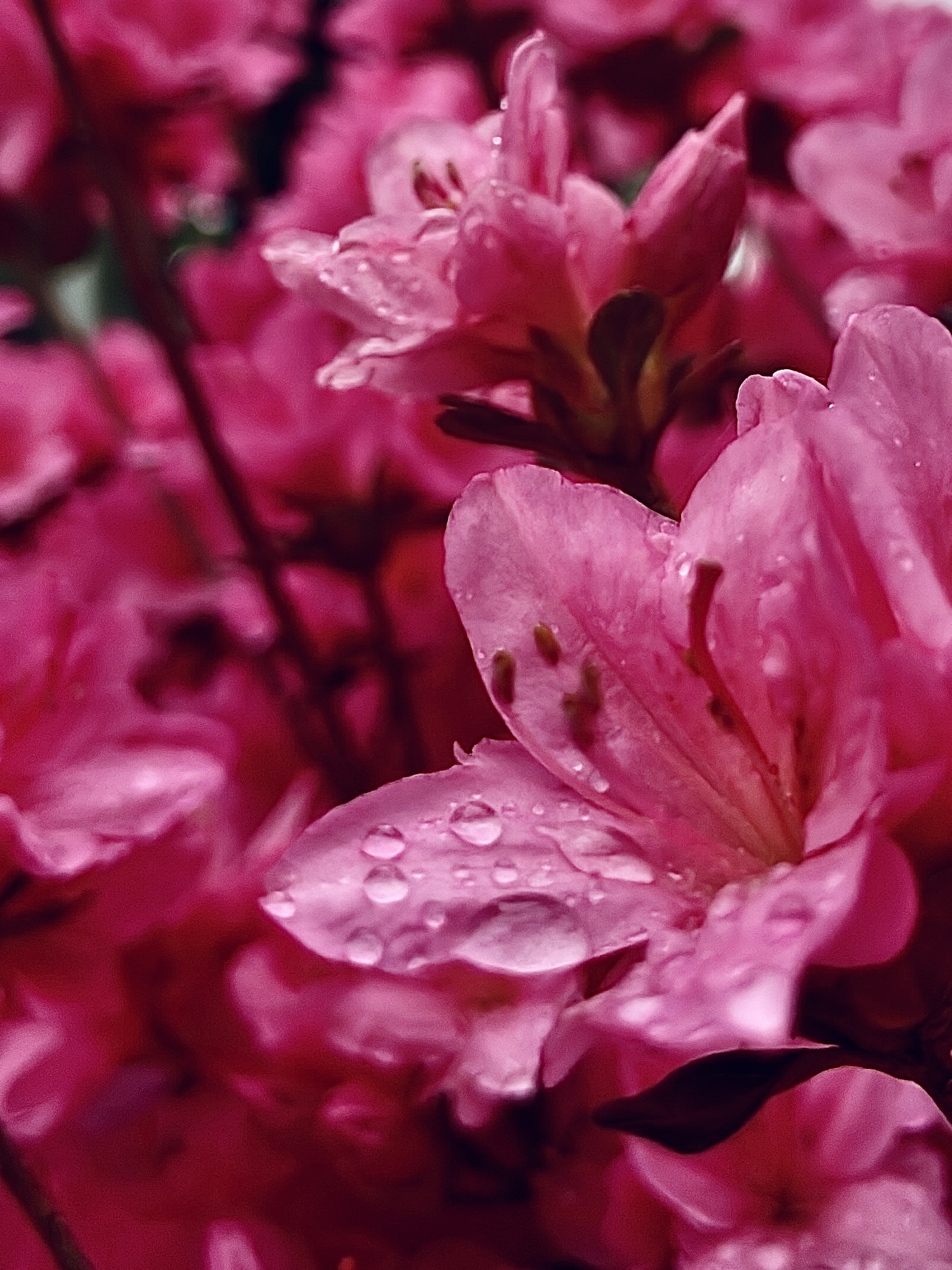
Here are some other photos I've took, that I'd consider "good". For the first photo, I like the soft blur distinguishing the bud from the background. In the second photo, I think the raindrops collected on the flower petals serve a good "sub-subject" of the photo!
These two photos below are what I'd consider "decent, but could be much better" through editing or initial capture. The first photo has potential in the sense that the pink flowers are positioned nicely at roughly the center. However, when I took the photo, the camera blurred, making it seem like there is a lack of subject focus. The second photo just feels kind of off to me. Perhaps it's the background yellow-green coloring. Or, how the petals appear as pink "blobs". I can't seem to phrase this flaw I find in the photo, but I know that if I positioned my iPhone to capture the flower stigmas or filament, maybe the photo would turn out better.